tooltip
When To Use
- The tip is shown on mouse enter, and is hidden on mouse leave. The Tooltip doesn’t support complex text or operations.
- To provide an explanation of a
button/text/operation. It’s often used instead of the htmltitleattribute.
Examples
Basic
import React from 'react';
import { Tooltip } from 'antd';

const App: React.FC = () => (
  <Tooltip title="prompt text">
    <span>Tooltip will show on mouse enter.</span>
  </Tooltip>
);

export default App;
Placement
import React from 'react';
import { Button, ConfigProvider, Flex, Tooltip } from 'antd';

const text = <span>prompt text</span>;

const buttonWidth = 80;

const App: React.FC = () => (
  <ConfigProvider button={{ style: { width: buttonWidth, margin: 4 } }}>
    <Flex vertical justify="center" align="center" className="demo">
      <Flex justify="center" align="center" style={{ whiteSpace: 'nowrap' }}>
        <Tooltip placement="topLeft" title={text}>
          <Button>TL</Button>
        </Tooltip>
        <Tooltip placement="top" title={text}>
          <Button>Top</Button>
        </Tooltip>
        <Tooltip placement="topRight" title={text}>
          <Button>TR</Button>
        </Tooltip>
      </Flex>
      <Flex style={{ width: buttonWidth * 5 + 32 }} justify="space-between" align="center">
        <Flex align="center" vertical>
          <Tooltip placement="leftTop" title={text}>
            <Button>LT</Button>
          </Tooltip>
          <Tooltip placement="left" title={text}>
            <Button>Left</Button>
          </Tooltip>
          <Tooltip placement="leftBottom" title={text}>
            <Button>LB</Button>
          </Tooltip>
        </Flex>
        <Flex align="center" vertical>
          <Tooltip placement="rightTop" title={text}>
            <Button>RT</Button>
          </Tooltip>
          <Tooltip placement="right" title={text}>
            <Button>Right</Button>
          </Tooltip>
          <Tooltip placement="rightBottom" title={text}>
            <Button>RB</Button>
          </Tooltip>
        </Flex>
      </Flex>
      <Flex justify="center" align="center" style={{ whiteSpace: 'nowrap' }}>
        <Tooltip placement="bottomLeft" title={text}>
          <Button>BL</Button>
        </Tooltip>
        <Tooltip placement="bottom" title={text}>
          <Button>Bottom</Button>
        </Tooltip>
        <Tooltip placement="bottomRight" title={text}>
          <Button>BR</Button>
        </Tooltip>
      </Flex>
    </Flex>
  </ConfigProvider>
);

export default App;
Arrow
import React, { useMemo, useState } from 'react';
import { Button, ConfigProvider, Flex, Segmented, Tooltip } from 'antd';
import type { TooltipProps } from 'antd';

const text = <span>prompt text</span>;

const buttonWidth = 80;

const App: React.FC = () => {
  const [arrow, setArrow] = useState<'Show' | 'Hide' | 'Center'>('Show');

  const mergedArrow = useMemo<TooltipProps['arrow']>(() => {
    if (arrow === 'Hide') {
      return false;
    }

    if (arrow === 'Show') {
      return true;
    }

    return {
      pointAtCenter: true,
    };
  }, [arrow]);

  return (
    <ConfigProvider button={{ style: { width: buttonWidth, margin: 4 } }}>
      <Segmented
        value={arrow}
        options={['Show', 'Hide', 'Center']}
        onChange={setArrow}
        style={{ marginBottom: 24 }}
      />
      <Flex vertical justify="center" align="center" className="demo">
        <Flex justify="center" align="center" style={{ whiteSpace: 'nowrap' }}>
          <Tooltip placement="topLeft" title={text} arrow={mergedArrow}>
            <Button>TL</Button>
          </Tooltip>
          <Tooltip placement="top" title={text} arrow={mergedArrow}>
            <Button>Top</Button>
          </Tooltip>
          <Tooltip placement="topRight" title={text} arrow={mergedArrow}>
            <Button>TR</Button>
          </Tooltip>
        </Flex>
        <Flex style={{ width: buttonWidth * 5 + 32 }} justify="space-between" align="center">
          <Flex align="center" vertical>
            <Tooltip placement="leftTop" title={text} arrow={mergedArrow}>
              <Button>LT</Button>
            </Tooltip>
            <Tooltip placement="left" title={text} arrow={mergedArrow}>
              <Button>Left</Button>
            </Tooltip>
            <Tooltip placement="leftBottom" title={text} arrow={mergedArrow}>
              <Button>LB</Button>
            </Tooltip>
          </Flex>
          <Flex align="center" vertical>
            <Tooltip placement="rightTop" title={text} arrow={mergedArrow}>
              <Button>RT</Button>
            </Tooltip>
            <Tooltip placement="right" title={text} arrow={mergedArrow}>
              <Button>Right</Button>
            </Tooltip>
            <Tooltip placement="rightBottom" title={text} arrow={mergedArrow}>
              <Button>RB</Button>
            </Tooltip>
          </Flex>
        </Flex>
        <Flex justify="center" align="center" style={{ whiteSpace: 'nowrap' }}>
          <Tooltip placement="bottomLeft" title={text} arrow={mergedArrow}>
            <Button>BL</Button>
          </Tooltip>
          <Tooltip placement="bottom" title={text} arrow={mergedArrow}>
            <Button>Bottom</Button>
          </Tooltip>
          <Tooltip placement="bottomRight" title={text} arrow={mergedArrow}>
            <Button>BR</Button>
          </Tooltip>
        </Flex>
      </Flex>
    </ConfigProvider>
  );
};

export default App;
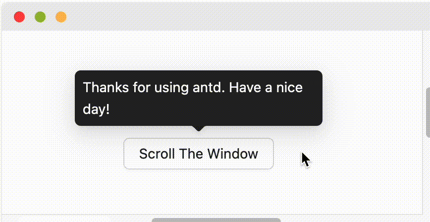
Auto Shift
import React from 'react';
import { Button, Tooltip } from 'antd';

const style: React.CSSProperties = {
  width: '300vw',
  height: '300vh',
  display: 'flex',
  alignItems: 'center',
  justifyContent: 'center',
};

const App: React.FC = () => {
  React.useEffect(() => {
    document.documentElement.scrollTop = document.documentElement.clientHeight;
    document.documentElement.scrollLeft = document.documentElement.clientWidth;
  }, []);
  return (
    <div style={style}>
      <Tooltip title="Thanks for using antd. Have a nice day !" open>
        <Button type="primary">Scroll The Window</Button>
      </Tooltip>
    </div>
  );
};

export default App;
Adjust placement automatically
import React from 'react';
import type { TooltipProps } from 'antd';
import { Button, Tooltip, Typography } from 'antd';

const Block = React.forwardRef<HTMLDivElement, Partial<TooltipProps>>((props, ref) => (
  <div
    style={{
      overflow: 'auto',
      position: 'relative',
      padding: '24px',
      border: '1px solid #e9e9e9',
    }}
    ref={ref}
  >
    <div
      style={{
        width: '200%',
        display: 'flex',
        flexDirection: 'column',
        alignItems: 'center',
        rowGap: 16,
      }}
    >
      <Tooltip {...props} placement="left" title="Prompt Text">
        <Button>Adjust automatically / 自动调整</Button>
      </Tooltip>
      <Tooltip {...props} placement="left" title="Prompt Text" autoAdjustOverflow={false}>
        <Button>Ignore / 不处理</Button>
      </Tooltip>
    </div>
  </div>
));

const App: React.FC = () => {
  const containerRef1 = React.useRef<HTMLDivElement>(null);
  const containerRef2 = React.useRef<HTMLDivElement>(null);

  React.useEffect(() => {
    containerRef1.current!.scrollLeft = containerRef1.current!.clientWidth * 0.5;
    containerRef2.current!.scrollLeft = containerRef2.current!.clientWidth * 0.5;
  }, []);

  return (
    <div style={{ display: 'flex', flexDirection: 'column', rowGap: 16 }}>
      <Typography.Title level={5}>With `getPopupContainer`</Typography.Title>
      <Block ref={containerRef1} getPopupContainer={(trigger) => trigger.parentElement!} />

      <Typography.Title level={5}>Without `getPopupContainer`</Typography.Title>
      <Block ref={containerRef2} />
    </div>
  );
};

export default App;
Destroy tooltip when hidden
import React from 'react';
import { Tooltip } from 'antd';

const App: React.FC = () => (
  <Tooltip destroyTooltipOnHide title="prompt text">
    <span>Tooltip will destroy when hidden.</span>
  </Tooltip>
);

export default App;
Colorful Tooltip
import React from 'react';
import { Button, Divider, Space, Tooltip } from 'antd';

const colors = [
  'pink',
  'red',
  'yellow',
  'orange',
  'cyan',
  'green',
  'blue',
  'purple',
  'geekblue',
  'magenta',
  'volcano',
  'gold',
  'lime',
];

const customColors = ['#f50', '#2db7f5', '#87d068', '#108ee9'];

const App: React.FC = () => (
  <>
    <Divider orientation="left">Presets</Divider>
    <Space wrap>
      {colors.map((color) => (
        <Tooltip title="prompt text" color={color} key={color}>
          <Button>{color}</Button>
        </Tooltip>
      ))}
    </Space>
    <Divider orientation="left">Custom</Divider>
    <Space wrap>
      {customColors.map((color) => (
        <Tooltip title="prompt text" color={color} key={color}>
          <Button>{color}</Button>
        </Tooltip>
      ))}
    </Space>
  </>
);

export default App;
_InternalPanelDoNotUseOrYouWillBeFired
import React from 'react';
import { Tooltip } from 'antd';

const { _InternalPanelDoNotUseOrYouWillBeFired: InternalTooltip } = Tooltip;

const App: React.FC = () => (
  <>
    <InternalTooltip title="Hello, Pink Pure Panel!" color="pink" />
    <InternalTooltip title="Hello, Customize Color Pure Panel!" color="#f50" />
    <InternalTooltip title="Hello, Pure Panel!" placement="bottomLeft" style={{ width: 200 }} />
  </>
);

export default App;
Debug
import React from 'react';
import { Button, Flex, Tooltip } from 'antd';

const zeroWidthEle = <div />;

const App: React.FC = () => (
  <Flex vertical gap={72} align="flex-start">
    <span />
    <Tooltip
      open
      title="Thanks for using antd. Have a nice day !"
      arrow={{ pointAtCenter: true }}
      placement="topLeft"
    >
      <Button>Point at center</Button>
    </Tooltip>
    <Tooltip open title={zeroWidthEle} placement="topLeft">
      <Button>Min Width</Button>
    </Tooltip>
    <Tooltip open title={zeroWidthEle} placement="top">
      <Button>Min Width</Button>
    </Tooltip>
  </Flex>
);

export default App;
Disabled
import React, { useState } from 'react';
import { Button, Space, Tooltip } from 'antd';

const App: React.FC = () => {
  const [disabled, setDisabled] = useState(true);

  return (
    <Space>
      <Button onClick={() => setDisabled(!disabled)}>{disabled ? 'Enable' : 'Disable'}</Button>
      <Tooltip title={disabled ? '' : 'prompt text'}>
        <span>Tooltip will show on mouse enter.</span>
      </Tooltip>
    </Space>
  );
};

export default App;
Disabled children
import React from 'react';
import { Button, Checkbox, Input, InputNumber, Select, Space, Tooltip } from 'antd';

const WrapperTooltip: React.FC<React.PropsWithChildren> = (props) => (
  <Tooltip title="Thanks for using antd. Have a nice day !" {...props} />
);

const App: React.FC = () => (
  <Space>
    <WrapperTooltip>
      <Button disabled>Disabled</Button>
    </WrapperTooltip>
    <WrapperTooltip>
      <Input disabled placeholder="disabled" />
    </WrapperTooltip>
    <WrapperTooltip>
      <InputNumber disabled />
    </WrapperTooltip>
    <WrapperTooltip>
      <Checkbox disabled />
    </WrapperTooltip>
    <WrapperTooltip>
      <Select disabled />
    </WrapperTooltip>
  </Space>
);

export default App;
API
Common props ref:Common props
| Property | Description | Type | Default |
|---|---|---|---|
| title | The text shown in the tooltip | ReactNode | () => ReactNode | - |
Common API
Design Token
FAQ
Why does the warning findDOMNode is deprecated sometimes appear in strict mode?
This is due to the implementation of rc-trigger. rc-trigger forces children to accept ref, otherwise it will fall back to findDOMNode, so children need to be native html tags. If not, you need to use React.forwardRef transparently passes ref to native html tags.
findDOMNode is deprecatedreproduce: https://codesandbox.io/p/sandbox/finddomnode-c5hy96- Using
forwardRefto fix: https://codesandbox.io/p/sandbox/no-finddomnode-warning-forked-gdxczs
Why sometime not work on HOC?
Please ensure that the child node of Tooltip accepts onMouseEnter, onMouseLeave, onPointerEnter, onPointerLeave, onFocus, onClick events.
What’s the placement logic?
It will follow placement config when screen has enough space. And flip when space is not enough (Such as top to bottom or topLeft to bottomLeft). Single direction such as top bottom left right will auto shift on the view:
When placement is set to edge align such as topLeft bottomRight, it will only do flip but not do shift.
Why Tooltip not update content when close?
Tooltip will cache content when it is closed to avoid flicker when content is updated:
// `title` will not blink when `user` is empty
<Tooltip open={user} title={user?.name} />
If need update content when close, you can set fresh property (#44830):
<Tooltip open={user} title={user?.name} fresh />